Most people who install an app never come back after the first session. That is not because the app is bad but because the first few minutes failed to show why it is worth keeping. Mobile app onboarding is the work of guiding a new user from install to the first moment of real value, and it covers far more than a welcome carousel. It includes the first screens, the permissions you request, the profile you ask for, the messages you send in the first week and the support you offer when something goes wrong. This guide explains how to design it, which messages to send across push, in-app and email, what to measure and the mistakes that lose users in the first minutes. It builds on our general guide to customer onboarding and focuses on the mobile case.
What is mobile app onboarding?
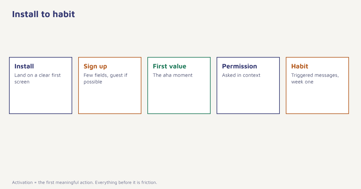
Onboarding is the process of helping new users succeed with a product. For mobile apps it begins at install and usually ends when the user has reached an “aha moment”, the first time the app does something useful for them, and has formed an early habit. The main target is activation: the user completing the first meaningful action, such as placing an order, creating a budget, finishing a lesson or sending a first message.
Principles that hold across app types
- Show value before asking for effort. Let people see or try something before asking for sign-up or permissions where you can.
- Ask for less. Every extra field, permission or tutorial screen loses some people.
- Teach by doing. A guided first task beats a five-screen explanation.
- Personalise early. One question about goals can tailor the whole first week. See personalization.
- Make the next step obvious. At each moment there should be one clear action.
The first-run experience
| Element | Good practice | Watch out for |
|---|---|---|
| Welcome screens | Two or three at most, each showing a benefit; allow skipping | Long carousels nobody reads |
| Sign-up | Offer phone number or social sign-in; allow guest access where possible | Forcing registration before any value |
| Profile questions | Ask only what changes the experience, one at a time | A long form on the first screen |
| Permissions | Ask in context with a short reason. See push opt-in | Asking for everything at launch |
| Empty states | Show an example and a clear first action | Blank screens that look broken |
| Tooltips and coach marks | Use sparingly at the exact moment of need | Covering the screen with pointers |
| Progress cues | Checklists, progress bars, small wins | Fake progress |
Messaging in the first week
What happens outside the app matters as much as what happens in it. A coordinated sequence across channels keeps new users moving. Each message should be tied to what the user has or has not done, not to a fixed day alone.
| When | Trigger | Channel | Message idea |
|---|---|---|---|
| Minutes after install | Install, no sign-up | Push (if allowed) or email later | Short reminder of the benefit and a one-tap return to sign-up |
| After sign-up | Account created | In-app, plus email | Welcome and the first task |
| Day 1 | No activation yet | Push or in-app | A nudge to complete the first action, with a deep link. See deep linking |
| After activation | First key action done | In-app | Celebrate and suggest the next step |
| Day 3 | Activated but no second visit | Push | Show something new or useful |
| Day 5 | Not activated | Email or WhatsApp where consented | Offer help, a short guide or a chat |
| Day 7 | Active | In-app | Introduce a second feature or invite friends |
| Day 14 | Dormant | Email, push | A reason to come back. See win-back campaigns |
In Flowfox, you build this as a journey that listens to events sent by the SDK, such as sign-up completed and first order placed, and branches on whether the user has activated. The same journey can use push, in-app messages, email and WhatsApp where consent exists. See the onboarding use case for a ready pattern.
How to design your onboarding
- Define activation. Choose the single action that best predicts that a new user will stay, based on your data.
- Map the shortest path to it. List every step between install and that action, then remove or delay what you can.
- Add personalisation only where it helps. One question about their goal is often enough.
- Place permission asks in context. Show the reason and the benefit first.
- Plan the first-week messages. Trigger them from behaviour, with suppression when the goal is met.
- Instrument every step. Send events so that you can see where people drop out. See sending your first event.
- Test one change at a time. Compare changes against a control. See A/B testing.
What to measure
| Metric | Definition | Why it matters |
|---|---|---|
| Install to sign-up rate | Sign-ups ÷ installs | Is the first screen convincing? |
| Activation rate | Users who complete the key action ÷ new users | The main onboarding outcome |
| Time to value | Time from install to the key action | Shorter usually means smoother onboarding |
| Step drop-off | Users lost at each screen | Where to fix first |
| Day-1, day-7 and day-30 retention | Share of a cohort active on those days | Longer-term effect. See cohort analysis |
| Permission rate | Push allowed ÷ shown prompt | Reachability |
Put these on one funnel and compare cohorts week by week. The general idea of a conversion funnel is explained under conversion funnel, and our guide to conversion rate optimization shows how to work on the worst step first. Retention targets are covered in app retention strategies.
A worked example
Picture a personal-finance app whose onboarding asks for name, email, income range, bank link and notification permission on five separate screens. Many people stop at the bank link. The team restructures: it lets users start by adding a single expense by hand, shows a simple chart immediately, then asks which goal matters most, saving, tracking or debt. Only after the first chart does it explain the benefit of linking a bank and ask. Notifications are requested after the user sets a goal, with the line “Get a nudge when you are close to your limit”. A journey then sends a day-1 reminder to people who have not logged an expense and a day-3 tip to those who have. The app and results are invented, and no figures are claimed, but the changes follow the principles above: value first, fewer asks, ask in context and messages tied to behaviour.
Support and recovery during onboarding
Some users will get stuck however good the flow is, so plan for it. A visible help option on the screens where people tend to stall, a short in-app chat or a link to a two-line answer can rescue a user who would otherwise leave. Watch for signals of trouble: repeated attempts at the same step, errors during sign-up, a long gap between install and first action. Each of these can trigger a gentle message offering help rather than a generic reminder. The quality of the experience at this stage is part of the broader field of user experience design, and it is worth testing with five or six real people before launch, watching where they hesitate. Do not forget accessibility and language: an onboarding flow that works only for people who read English quickly will lose many Indian users who would happily stay in their own language. Finally, close the loop with feedback. A one-question survey after the first week, using the methods in our guide to app survey questions, tells you why people stayed or left and gives your team a list of fixes in the users’ own words.
Common mistakes
- A long tutorial before any value. People skip it.
- Asking for every permission at once. Each ask lowers trust.
- Forcing sign-up first. Let people look around where possible.
- Time-based messages only. A user who already activated should not get a nudge to do it.
- Not measuring steps. You cannot fix what you cannot see.
- Forgetting support. A visible help option rescues stuck users.
Onboarding is not a tour of your app. It is the shortest path to the moment the user thinks: this is useful.
Guide new users to their first win. Build a behaviour-triggered onboarding journey across push, in-app, email and WhatsApp.
Read next: SaaS onboarding emails, mobile app engagement and the blog.
Frequently asked questions
What is mobile app onboarding?
Mobile app onboarding is the process of guiding new users from install to their first moment of real value, including first screens, permissions, profile setup and early messages.
What is activation in a mobile app?
Activation is the user completing the first meaningful action, such as placing an order or creating a budget, which best predicts that they will keep using the app.
How many onboarding screens should an app have?
As few as possible. Two or three benefit-led welcome screens at most, with a skip option, and let users reach the first task quickly.
When should an app ask for notification permission?
After the user has done something that makes notifications clearly useful, with a short explanation of the benefit before the system prompt.
What messages should I send in the first week?
Send behaviour-triggered messages: a welcome after sign-up, a nudge to the first key action, a celebration after it, a tip on day 3 and a help offer to those who have not activated.
How do I measure onboarding success?
Track install to sign-up rate, activation rate, time to value, drop-off at each step and day-1, day-7 and day-30 retention.
Should onboarding be personalised?
Often yes, lightly. One question about the user’s goal can tailor screens and messages, without a long form.