Most marketing emails are scanned for two seconds on a phone, often in bad light, by someone doing something else. Good email design is not about decoration. It is about making the one thing you want the reader to do obvious, quick to read and easy to tap. This guide covers the practical rules: layout, width, fonts, colour, images, buttons, dark mode, accessibility, and the quirks of email clients that make email design harder than web design. It finishes with a pre-send checklist you can reuse for every campaign.
Start with one goal
Before you pick a template, decide what a successful email looks like. Is it a click to a product page, a reply, a booking? Every design choice should serve that single action. Emails with a clear primary call to action tend to be easier to read than those that offer six equally weighted options. If you have several things to say, put them in order of importance and let the secondary items be visibly smaller. This is the same discipline we recommend for the content side in our guide to email marketing, and it is the hardest part of design because it needs you to leave things out.
Layout that works on a phone
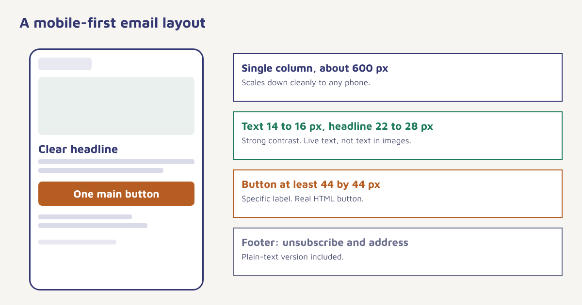
- Single column. It reads well on every screen and avoids the squeezed layouts that multi-column designs produce on phones.
- Width of about 600 pixels. A long-standing convention that fits most desktop previews and scales down cleanly.
- Short paragraphs. Two or three lines each, with space between them.
- Put the point above the fold. The headline and button should be visible without scrolling on a phone.
- Use whitespace. Padding between blocks makes scanning easier.
- Keep the length sensible. Long enough to persuade, short enough to scan. Newsletters can be longer than promotions.
Email clients render HTML differently from browsers. Some strip styles, some block images by default and some ignore modern CSS. The email client landscape is fragmented, so designers build emails with tables, inline styles and conservative techniques that older clients understand. A visual email builder hides this complexity and produces code that works across clients, which is one reason to use one instead of hand-coding every message.
Typography and colour
| Element | Guideline | Why |
|---|---|---|
| Body text size | 14 to 16 px, with 1.4 to 1.6 line height | Readable on phones without zooming |
| Headline size | 22 to 28 px | Clear hierarchy |
| Fonts | Web-safe stack with a fallback, such as Arial, Helvetica or Georgia | Custom fonts may not load in every client |
| Colour contrast | Dark text on a light background, or the reverse, with strong contrast | Legibility and accessibility |
| Brand colours | Use one or two, with one reserved for the button | Draws the eye to the action |
| Links | Underlined or clearly coloured | Obvious what can be tapped |
Aim for a contrast ratio that meets the Web Content Accessibility Guidelines recommendation of at least 4.5 to 1 for normal text. Free contrast checkers make this easy to test. Avoid light grey text on white, which looks elegant on a designer’s screen and unreadable on a phone in sunlight.
Images, with caution
Images make an email attractive, but they come with risks. Many clients block images until the reader allows them, so an email made of one big picture can arrive as a blank rectangle. Keep a healthy balance of live text and images, use descriptive alt text for every image, set background colours behind images so the layout holds when they are blocked and compress files so the email loads fast on mobile data. Avoid putting your key message or button inside an image, since it will not be readable, clickable or accessible to everyone. The rules on alternative text are simple: describe what the image shows or what it does, in a few words, and leave the alt text empty for purely decorative images.
Buttons and calls to action
- Make it a real button. Use a bulletproof HTML button, not an image, so it still works when images are blocked.
- Size for thumbs. At least 44 by 44 pixels, with space around it so nobody taps the wrong thing.
- Write a specific label. “Track my order” beats “Click here”.
- Repeat it once. In a longer email, a second button near the end helps, with the same wording.
- One primary button. Secondary options can be text links.
Test the unhappy path. Open your email with images off, on a small phone, in dark mode and in a client you do not normally use. If the message still makes sense and the button still works, the design is solid.
Dark mode
Many people read email in dark mode. Some clients invert colours automatically, which can turn a dark logo on a transparent background into an invisible smudge, or wash out your brand colours. Protect yourself with a few habits: use logos with a thin light outline or on a solid background, avoid pure white image backgrounds that glow in dark mode, choose colours that survive inversion and preview in both modes before sending. Where the client supports it, you can define a dark colour scheme in the email’s styles, but treat that as an enhancement, because support varies.
Accessibility
Accessible design is better design for everyone. Use real headings in order, descriptive link text, alt text on images, a plain-text version of the email, strong colour contrast, a readable font size and a layout that works when zoomed. Do not rely on colour alone to convey meaning. Set the language of the email so screen readers pronounce it correctly. These steps also help with deliverability, since a well-structured email with a text version looks more legitimate to filters. See our deliverability guide for the wider picture.
A design process you can repeat
- Write the message first. Subject, preheader, headline, two sentences and a button label. Design comes second.
- Pick a proven template. Start from a layout that already works and adjust it.
- Build in the email builder. Use blocks, global styles and saved brand colours in the email builder.
- Add personalisation. Use the name and relevant details, with fallbacks. See Liquid.
- Check the plain text version. Make sure it reads well on its own.
- Preview on devices and modes. Phone, desktop, dark mode, images off.
- Send a test. To yourself and to a colleague on a different email app.
- Check links and tracking. Click every link and confirm the destination.
Pre-send checklist
| Check | Done when |
|---|---|
| Subject and preheader | Specific, under about 50 characters, preheader written. See subject lines |
| From name and address | Recognisable and consistent |
| Single main call to action | One primary button above the fold |
| Mobile layout | Single column, readable text, tappable buttons |
| Images | Alt text, compressed, backgrounds set |
| Links | All working, correct destination, tracked |
| Footer | Unsubscribe link, company address, preferences |
| Plain text version | Present and readable |
| Authentication | SPF, DKIM, DMARC pass. See setup |
The best way to improve a design is to test it. Try one change at a time, such as the button colour, the headline or the hero image, and measure clicks and not just opens. Our A/B testing guide shows how to run a fair test, and email marketing metrics explains which numbers to trust. Design also carries your brand: consistent colours, tone and layout make your messages recognisable before the subject line is even read. For the broader field, see the email marketing overview and the principles of responsive design.
Common mistakes
- One giant image. Blocked images leave a blank email.
- Tiny text. Anything under 14 pixels strains eyes on phones.
- Too many buttons. A crowded choice becomes no choice.
- Ignoring dark mode. Logos and images can vanish.
- Skipping the plain text version. It affects accessibility and filtering.
- Forgetting the footer. Unsubscribe links and contact details build trust and meet legal requirements.
Good email design is invisible. The reader just does what you asked.
Design once, send everywhere. Build responsive emails with reusable blocks, brand styles and previews.
Read next: email newsletters and transactional emails, and visit the blog.
Frequently asked questions
What is the best width for an email?
About 600 pixels is a long-standing convention for desktop, with a single-column layout that scales down on phones.
What font size should I use in emails?
Use 14 to 16 pixels for body text and 22 to 28 pixels for headlines, with a line height of about 1.4 to 1.6 for readability on phones.
How many images should an email have?
Use images to support the message, but keep a healthy balance of live text. Always add alt text, and never put the key message or button inside an image.
Should I design emails for dark mode?
Yes. Many readers use dark mode, so choose logos and colours that survive inversion and preview your email in both modes before sending.
How big should an email button be?
At least about 44 by 44 pixels with space around it, built as a real HTML button with a specific label such as Track my order.
Why does my email look different in different email apps?
Email clients render HTML and CSS differently, and many ignore modern web techniques. Use tested templates, simple layouts and previews across clients.
Do I need a plain text version of my email?
Yes. A plain text version helps accessibility and is a sign of a well-formed message that some filters look for.